Tag Archives: Palladio

Comparing Tools

The tools examined during the past three modules, Voyant, Kepler, and Palladio, allowed for different levels of data analysis and visualization. One could see these tools are serving different needs dictated by the kind of data-set that need to examined. Voyant enables researchers to text-mine large volumes of mostly unstructured text. Kepler produces map visualizations that require files that have been tagged for geographical locations. Palladio creates network visualizations that required highly structured files.

One could say that Voyant offered the opportunity of a relatively open-ended exploration of the WPA Slave Narratives.As a text mining tool, Voyant proved to be very effective when examining a large volume of relatively unstructured data. The five tools included in Voyant (Cirrus, Reader, Trends, Summary and Contexts) provide different entry points into the data and different ways in which said data could be re-organized, explored and visualized. Although Voyant is largely meant to be used by researchers, I can also see how it could be used by public historians, museum professionals and teachers. The Cirrus tool, for instance, produces powerful visualization that can enrich lectures and exhibits. In contrast, I found the Trends tool more difficult to manipulate and read. It was easy to see how many times a word would appear in the different State collections, but I could not easily explore other kinds of trends such chronological distribution, age or gender.  These limitations are understandable given that text mining seeks for individual words or groups of words, and not for categories of words.

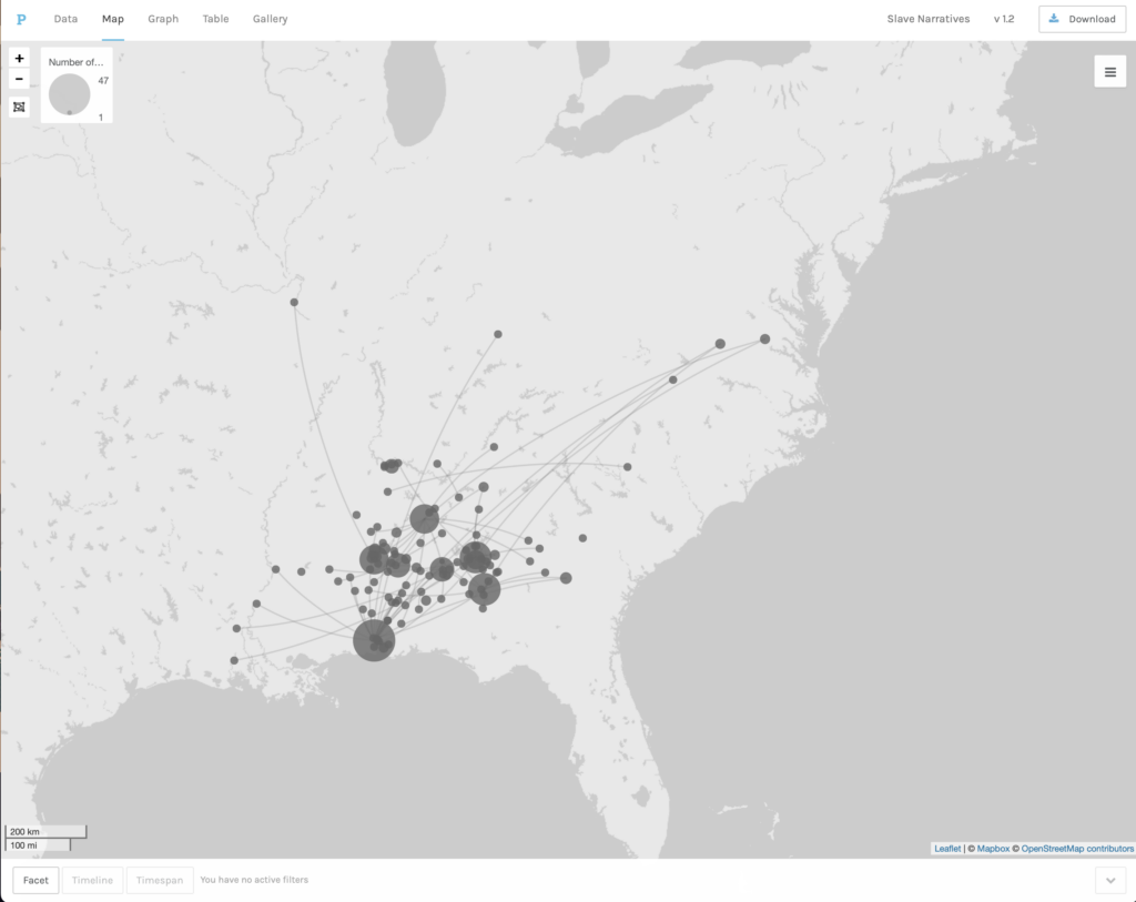
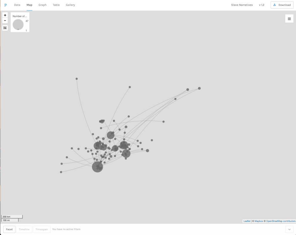
Kepler used more structured data than the one used in Voyant. For this reason, we were able to illustrate different aspects of the WPA Slave Narratives. The maps we produced, using geo-tagged CSV files, allowed us to see the relative volume of interviews done in a particular region. It was also possible to create a map that presented a timeline. Yet, the visualizations produced with Kepler did not give us any idea about the content of the interviews. Thus, I found Kepler to be a very good complement to Voyant. While Voyant provided us with the possibility of analyzing the content of the interviews, Kepler enabled us to visualize the broader geographical and chronological context in which the interviews were performed. Also, I found the visualizations created with Kepler were easier to read and manipulate than those produced to Voyant. This is not a criticism of the effectiveness of Voyant. When working with Kepler we used a smaller and more structured data-set prepared to answer more focused questions about time, place and volume; while Voyant was meant to facilitate a more open ended exploration of the ideas contained in a much larger set of documents. 

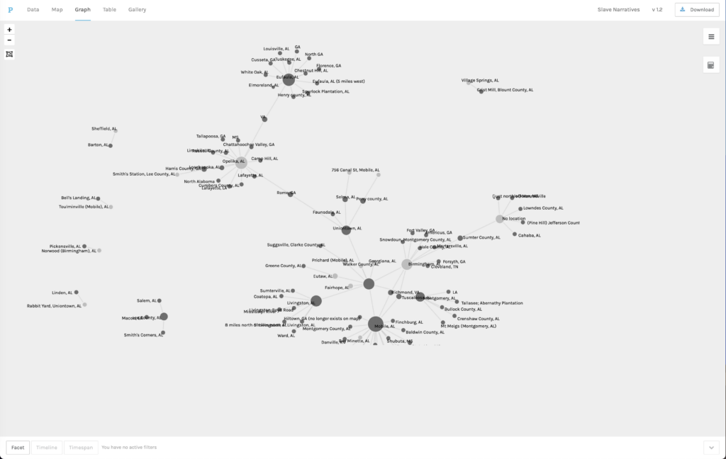
The last tool we used was Palladio, a network analysis and visualization tool. From all the tools examined, Palladio required the most rich and structured data-set. The goal of this tool is to allow researcher to identify patterns of connection or relationships between different categories of data. Palladio was very effective when producing visualization of different types of relationships. For instance, we are able to create a map where we saw where slaves had been enslaved in relation to where they were interviewed. We were also able to illustrate connections between the topics addressed in the interviews and the gender, age, or type of work of former slaves. In this regard, Palladio proved to be the most flexible of all three tools in terms of the kinds of questions it could help researchers explore. But the power of the tool was only made possible by the quality of the data and the way in which it was structured. 

Experimenting with these tools made me more aware of the challenges and potential inherent to the use of digitized sources. Ultimately, the use of any of these tools will require that data is digitized and structured to some degree and in light of particular questions. For this reason, I think it is important to have different types of tools that work with different types of files. Tools that allow for more open-ended questions like Voyant, or for a more focused exploration like Palladio. In either case, the larger challenge is to ensure that the digitization and preparation of the data is done thoughtfully and professionally. The ultimate effectiveness of any of these tools will largely depend on the quality of the data and the expertise of the researchers using it.

Palladio and Network Graphs

Network visualization projects allow users to observe the amount and overall shape of connections between individuals, institutions, locations, etc. The information used to document these connections can be extracted from different types of digitized materials. Arguably, the power of this type of visualization lies in its ability to highlight patterns a of discreet connections that are not easy to discern in large text corpora.

Working with Palladio made it possible to see more clearly the strengths and weaknesses of network visualizations. One point that was made very clear in the readings, and in the projects we examined, is that this type of visualizations require a careful and informed preparation of the data that is to be used. For this example, we were given three csv. files from the WPA Slave Narratives project that had been prepared to be used with Palladio. Even with this clear advantage, it took me a good forty minutes to upload the files. Every time I tried to load a file I got a message alerting me to an error in one of the lines. But I could not figure out what the error was. In the end, I decided not to use a downloaded file, but I simply opened it directly from the link and copied and pasted the contents into Palladio. Somehow, this did the trick and I was able start the work.  This was just a good example of how useful it is to understand the requirements of the software and the ways in which data should be presented.

For our first exercise we were asked to do a map visualization. In this case, we were to connect the place where interviewees had been enslaved with the place where they were interviewed. The first map visualization used the background of a land map, which was useful to get an idea of how far or how close former slaves had worked before they moved to Alabama. The map showed that the majority of slaves interviewed in Alabama had been enslaved relatively closely to where they were interviewed. Very few came from further north. The second visualization removed the map base, leaving an image that resembled more a network graph, but without a what nods and edges represented. This was a good way of understanding better the differences between a map visualization and a network graph and the possibilities of each of these tools. 

A third exercise asked us to produce a network graph. In this case, the particular features of the network visualization (the ability to highlight one type of nod, to make them bigger or smaller depending on the number of interviews) made the visualization more useful to discern the how many slaves interviewed in particular Alabama locations had come from other places. By focusing on some of the larger nods, a researcher could find some meaningful patters about the movement of slaves during the years after emancipation. However, I have to admit that my knowledge of the historiography on this question only allowed for some general observations, which, in this case confirmed what we had seen in the map, that slaves came from many different places, but mostly had not moved very far from where they had been enslaved.

These exercises illustrate what can be both a weakness and a strength of network visualization. Network graphs can tell a lot of information about discreet types of data, but they can only handle so many variables at one time, a very large volume of information can produce a visualization that is difficult to read. However, Palladio allows users to filter some of the data that goes into a visualization. For instance, we were asked to create a graph that illustrated the relationship between Interviewers and Interview Subjects. We were then able to use facets to further filter the data that went into the visualization. In this case we chose to filter by Gender and Type of  Work. I was not able to discern any particular patterns from this exercise, but it showed that the strength of network analysis relies on its ability to focus one’s attention on specific types of connections. Some will prove to be very revealing, while others much less so. But the possibility of changing the elements of the graph and exploring different configurations is where the possibilities of Palladio proved most useful.

Needless to say, however, the power and flexibility of the tool is largely contingent on the data that is used. The last set of exercises confirmed both that network analysis allows for very interesting explorations of data, but also that such data needs to be already rich and adequately formatted to allow for a successful exploration. In the last set of exercises we created network graphs that connected gender, type of work, age, and interviewer to the topics that were explored in the interviews. The different visualizations generated showed that neither of these factors seemed to have a dramatic impact on the topics addressed by former slaves. However, these observations are based on the general overall visualizations. Subtle differences may yet to be discovered if we were to further filter the data. Which brings me back to the factors that can make or break this kind of tool, first the quality and richness of the data itself, and the level of expertise of those designing and using the tool.

Could this not be asked of any other research project, digital or otherwise? Is the expense and preparation invested in this kind of project proportional to the time saved or the potential findings? In my original review I concluded that it is not always clear that the research gains justify the investment involved in creating and deploying this kind of tool. However, I also observed that what is gained may be of a different nature. Network analysis tools are not tools for the public historian hoping to bring historical thinking and historical sources to a larger public. These are sophisticated tools of analysis that should be developed by experts for experts. Their design and use require serious understanding of the sources and historiography. I am sure that had I been better versed in the history of slavery and emancipation in Alabama, some of these visualizations would have been much more meaningful to me. My experience working with Palladio, however, encouraged me to be a better historian, to be more thoughtful and intentional about the questions I ask, more careful about the assumptions I make about my evidence, and ultimately, more flexible and creative about how sources can help answer old and new questions. As it was stated repeatedly in our readings, network visualizations are not here to replace the exercise of reading through sources or becoming familiar with historiography, they are here to make us better thinkers and users of sources and historiography.